Announced by Pantone, Benjamin Moore, Behr, Sherwin Williams and Glidden they each have their own meaning and reasoning, yet when put side by side, they bring a bigger picture. With the perfect mix of subtle and bold, the colours for this year form a message of empowerment, new beginnings and connection.
This year will be about our creative expression and the way we use it to bring happiness all around. Let’s take a closer look at each colour and the message behind it.
Behr: Blank Canvas
Starting with Behr’s colour of the year: Blank Canvas. This colour is exactly the vibe it sets out to be: a fresh start. This colour gives anyone who wants it, the chance to start again. Both refreshing and inspiring, allowing the opportunity to choose the way you want to express yourself, in your home and everyday life.
Pantone: Viva Magenta
Pantone’s Viva Magenta is the colour of the year that is fearless in its pursuit to write a new narrative. This colour was chosen to inspire people to take the leap into brighter and bolder, in order to “experience the transformational power of color”. A colour that is unapologetic, encouraging others to be the same in their self-expression. It inspires experimentation and feelings of joy, a way to go about life that is full of optimism and beauty.
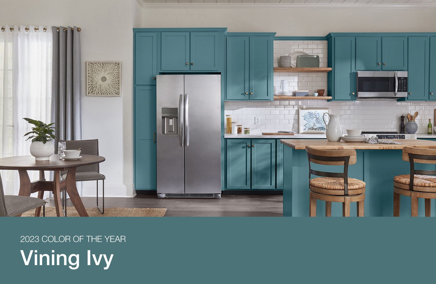
Glidden: Vining Ivy
Glidden went with a “bluish-greenish-something-in-betweenish” vibe, choosing Vining Ivy as their colour of the year. It’s refreshing and a subtle shift from the moss and ivy greens we saw last year This versatile shade can elevate any setting. It’s a conversation starter, encouraging people to see things with a new perspective. Glidden’s overarching theme for this year was reflection, hoping to inspire people to reflect in on varying perspectives.
Benjamin Moore: Raspberry Blush
Benjamin Moore’s Raspberry Blush is for those looking to take a step out of their comfort zone and toward more colour. With the same intention as Pantone, this colour is an unapologetic shade that dares to be bold, with a charismatic twist. Whether it's an accent or the main attraction, this shade brings joy to its environment.
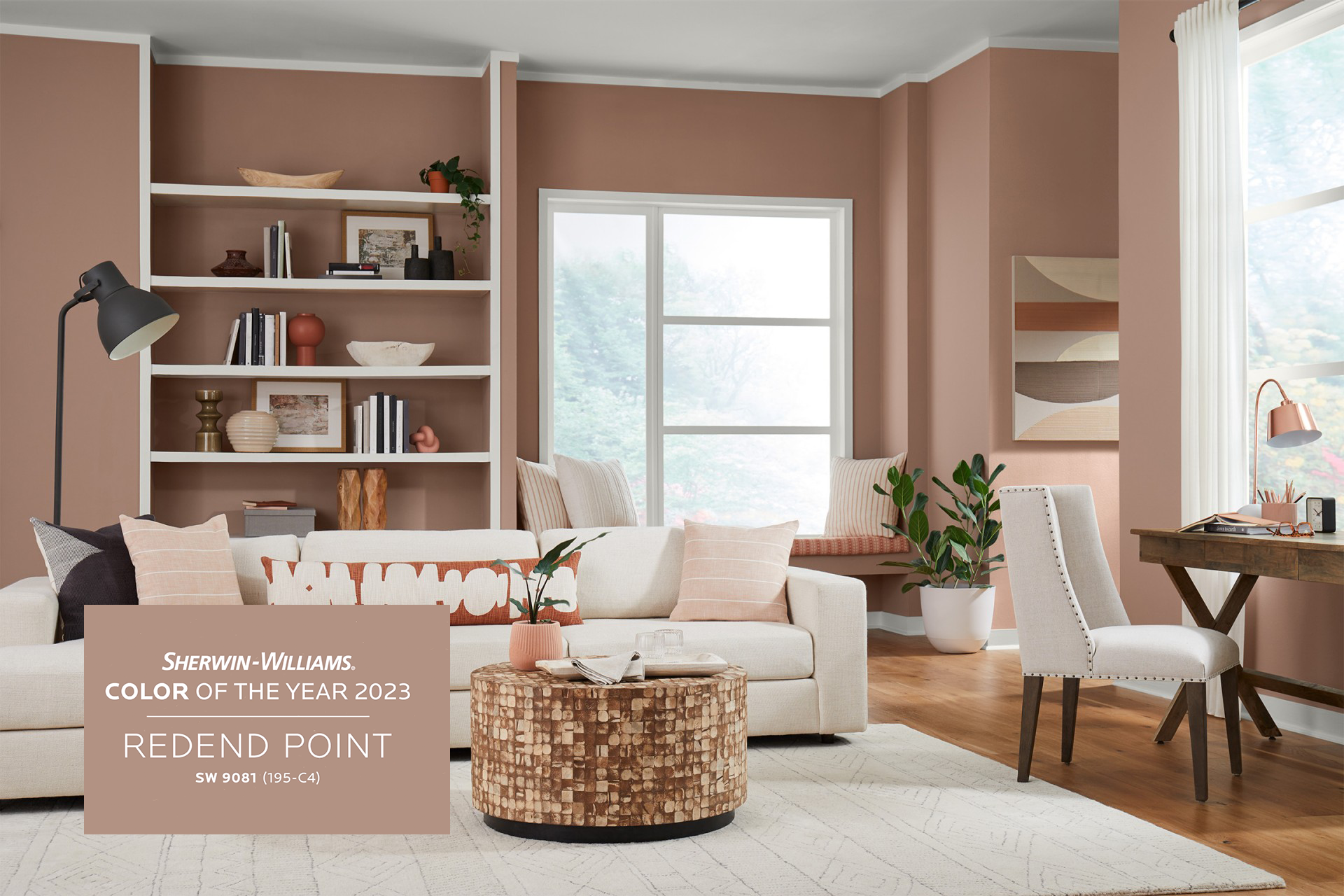
Sherwin Williams: Redend Point
Last but not least, comes Sherwin-Williams Redend Point. This neutral is a choice for those looking for natural, with a hint of warmth. Its welcoming colour that inspires connection. it’s the perfect shade for a living room or family room, being described as a “joyful neutral. This shade was chosen to invite compassion into any space, and reminds us to use that compassion with ourselves and others.
It’s no coincidence that these shades go well together in colour and meaning. This pallet sets the tone for a year ahead filled with inspiration and connection. We are ready to set the tone to be our brightest, boldest, most compassionate selves!
Also Read: Event Space Toronto, wedding venue Toronto, Wedding Reception Toronto


